

- Media library
- Question limits
- Creating a survey from MS Word doc
- How to edit live surveys
- Survey blocks
- Survey block randomizer
- Question randomization
- Scale Library
- What is monadic testing?
- What is sequential monadic testing?
- Extraction Support for Image Chooser Question Types
- What is comparison testing?
- Custom validation messages
- Survey Builder with QxBot
- Testing Send
- Standard question types
- Advanced question types
- Multiple choice question type
- Text question- comment box
- Matrix multi-point scales question type
- Rank order question
- Smiley-rating question
- Image question type
- Date and time question type
- CAPTCHA question type
- Net Promoter Score question type
- Van Westendorp's price sensitivity question
- Choice modelling questions
- Side-By-Side matrix question
- Homunculus question type
- Predictive answer options
- Presentation text questions
- Multiple choice: select one
- Multiple choice: select many
- Page timer
- Contact information question
- Matrix multi-select question
- Matrix spreadsheet question
- Closed card sorting question
- Flex Matrix
- Text Slider Question Type
- Graphical Rating Scales
- Rank Order - Drag and Drop
- Bipolar Matrix - Slider
- Bipolar Matrix Likert Scale
- Gabor Granger
- Verified Digital Signature
- Star Rating Question Type
- Push to social
- Attach Upload File Question
- Constant Sum Question
- Video Insights
- Platform connect
- Communities Recruitment
- TubePulse
- Open Card Sorting
- Map Question Type
- Answer type
- Reorder questions
- Question tips
- Text box next to question
- Text question settings
- Adding other option
- Matrix question settings
- Image rating question settings
- Scale options for numeric slider question
- Constant sum question settings
- Setting default answer option
- Exclusive option for multiple choice questions
- Validate question
- Bulk validation settings
- Remove validation message
- Question separators
- Question Code
- Page breaks in survey
- Survey introduction with acceptance checkbox
- RegEx Validation
- Question Library
- Embed Media
- Slider Start Position
- Answer Display - Alternate Flip
- Matrix - Auto Focus Mode
- Text validations
- Numeric Input Settings- Spreadsheet
- Answer Groups
- Hidden Questions
- Decimal Separator Currency Format
- Allow Multiple Files - Attache/Upload Question Type
- Text box - Keyboard input type
- Deep Dive
- Answer Display Order
- Alternate colors
- Add logo to survey
- Custom Themes
- Display Settings
- Auto-advance
- Progress bar
- Automatic question numbering option
- Enabling social network toolbar
- Browser Title
- Print or export to PDF, DOC
- Survey Navigation Buttons
- Accessible Theme
- Back and Exit Navigation Buttons
- Focus Mode
- Survey Layout
- Survey Layout - Visual
- Telly Integration
- Telly Integration
- Workspace URL
- Classic Layout
- Branching - Skip Logic
- Compound Branching
- Compound or delayed branching
- Response Based Quota Control
- Dynamic text or comment boxes
- Extraction logic
- Show or hide question logic
- Dynamic show or hide
- Scoring logic
- Net promoter scoring model
- Piping text
- Survey chaining
- Looping logic
- Branching to terminate survey
- Logic operators
- Selected N of M logic
- JavaScript Logic Syntax Reference
- Block Flow
- Block Looping
- Scoring Engine: Syntax Reference
- Always Extract and Never Extract Logic
- Matrix Extraction
- Locked Extraction
- Dynamic Custom Variable Update
- Advanced Randomization
- Custom Scripting Examples
- Survey settings
- Save & continue
- Anti Ballot Box Stuffing (ABBS) - disable multiple responses
- Deactivate survey
- Admin confirmation email
- Action alerts
- Survey timeout
- Finish options
- Spotlight report
- Print survey response
- Search and replace
- Survey Timer
- Allowing multiple respondents from the same device
- Text Input Size Settings
- Admin Confirmation Emails
- Survey Close Date
- Respondent Location Data
- Review Mode
- Review, Edit and Print Responses
- Geo coding
- Dynamic Progress Bar
- Response Quota
- Age Verification
- Tools - Survey Options
- Live survey URL
- Customize survey URL
- Create email invitation
- Personalizing emails
- Email invitation settings
- Email list filter
- Survey reminders
- Export batch
- Email status
- Spam index
- Send surveys via SMS
- Phone & paper
- Adding responses manually
- SMS Pricing
- Embedding Question In Email
- Deleting Email Lists
- Multilingual Survey Distribution
- SMTP
- Reply-To Email Address
- Domain Authentication
- Email Delivery Troubleshooting
- QR Code
- Survey Dashboard - Report
- Overall participant statistics
- Dropout analysis
- Pivot table
- Turf analysis
- Trend analysis
- Correlation analysis
- Survey comparison
- Gap analysis
- Mean calculation
- Weighted mean
- Spider chart
- Cluster Analysis
- Dashboard filter
- Datapad
- Download Options - Dashboard
- HotSpot analysis
- Heatmap analysis
- Weighted Rank Order
- Cross-Tabulation Grouping Answer Options
- A/B Testing in QuestionPro Surveys
- Data Quality
- Data Quality Terminates
- Matrix Heatmap Chart
- Column proportions test
- Response Identifier
- TURF Reach Analysis
- Conjoint analysis designs
- Conjoint part worths calculation
- Conjoint calculations and methodology
- Conjoint attribute importance
- Conjoint profiles
- Market segmentation simulator
- Conjoint brand premium and price elasticity
- What is MaxDiff scaling
- MaxDiff settings
- Anchored MaxDiff Analysis [BETA Release]
- MaxDiff FAQ
- MaxDiff- Interpreting Results
- Automatic email report
- Data quality - Patterned responses
- Data quality - gibberish words
- Import external data
- Download center
- Consolidate report
- Delete survey data
- Data quality - All checkboxes selected
- Exporting data to Word or Powerpoint
- Scheduled reports
- Datapad
- Notification Group
- Unselected Checkbox Representation
- Merge Data 2.0
- Plagiarism Detection
- IP based location data
- SPSS Export
- SPSS variable name
- Update user details
- Update time zone
- Teams
- Add Users
- Usage dashboard
- Single user license
- License restrictions
- Troubleshooting login issues
- Software support package
- Welcome Email
- User Roles & Permissions
- Bulk Add Users
- Two-Factor Authentication
- Network Access
- Changing ownership of the survey
- Unable to access Chat support
- Navigating QuestionPro Products
- Agency Partnership Referral Program
- Response Limits

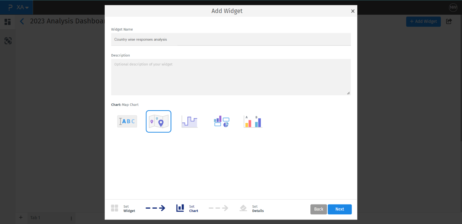
Map Chart Widget
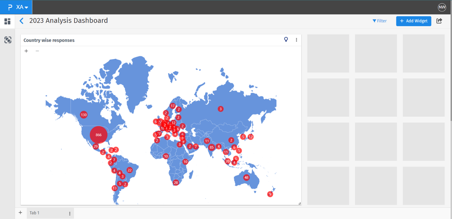
A map chart widget can be used to plot the country-wise responses’ distribution in terms of count or percentages. This widget uses the country information from the metadata collected by the system to plot the responses.
Once you are on the dashboard where you want to add the map chart widget >> Click on the “+Add Widget” button >> Click on “Advanced Widgets” >> select “Map Chart” and enter the widget name for the map chart widget >> Click on the Next button >> Select the survey for which you want to add the map chart widget >> Click on the “Save Widget” button
Map Chart:
You can access the map chart settings by clicking on the widget settings icon on the top right corner of the widget and choosing “Settings” from it.
Under general settings, you can turn on or off the widget name and you can edit the widget name from here as well.
You can turn on or off the highlighted insight for the widget under the general settings.
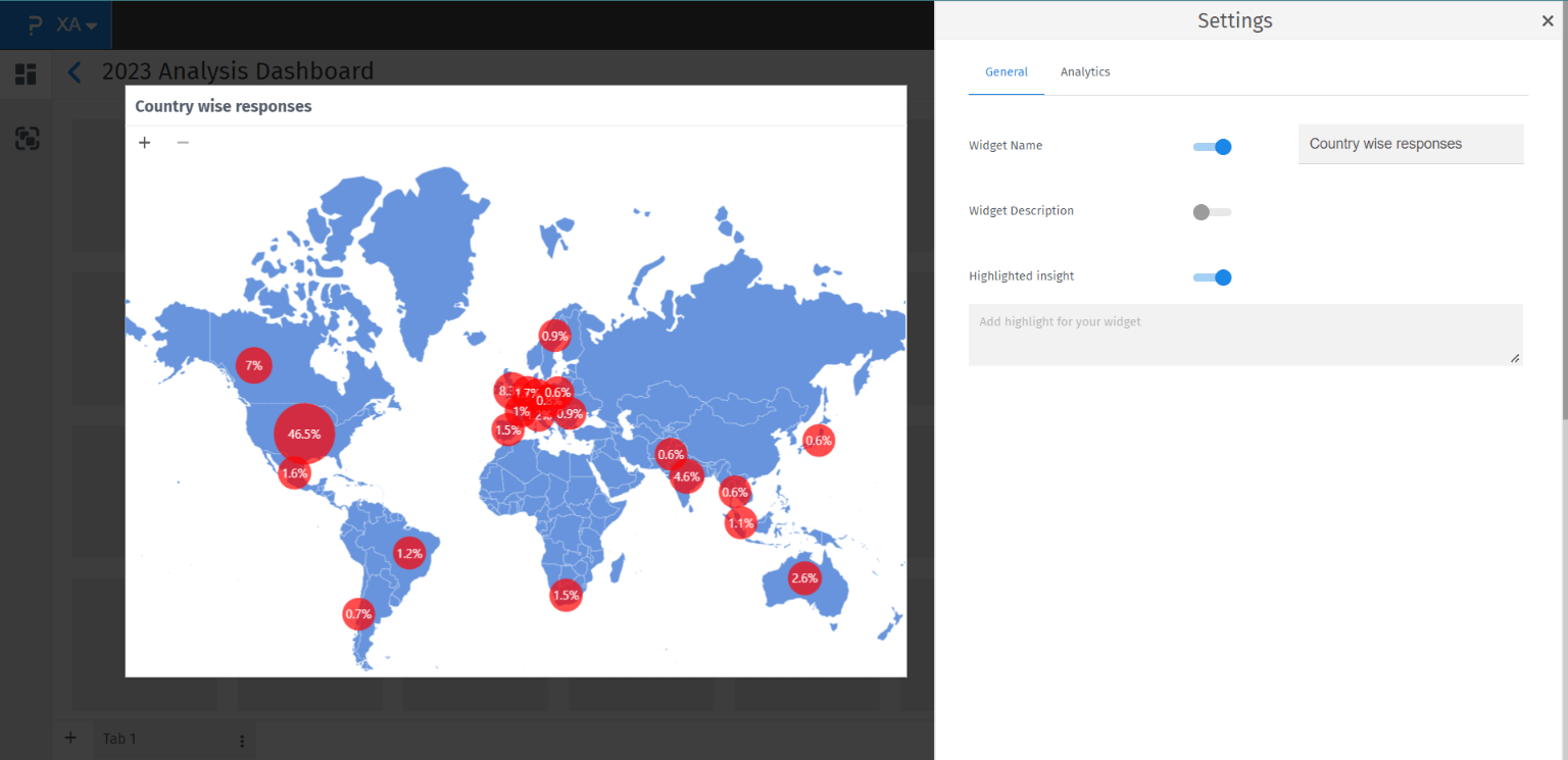
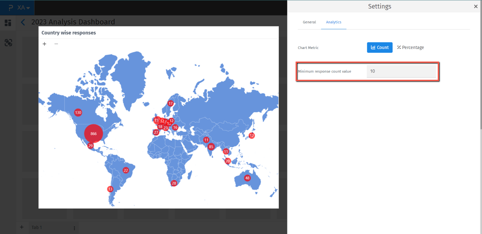
Chart Metric - You can change the metric to be shown on the chart, either count of responses for countries or the percentage share of responses for countries.
If you choose the Percentage chart metric you can set the decimal precision (either 0 or 1) for the data as per your choice.
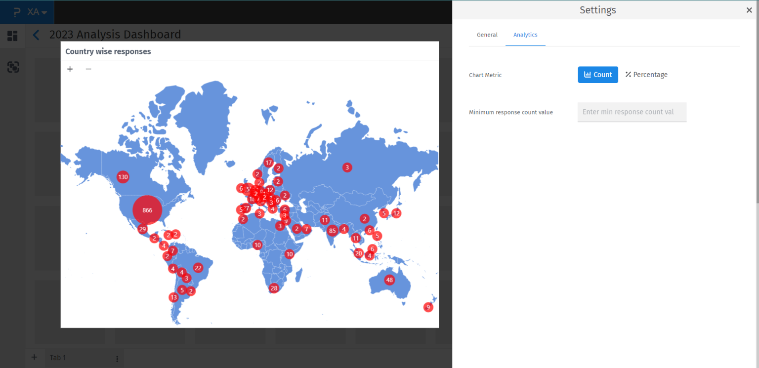
Minimum response count value - Using this setting you can add the minimum response count condition. Once the restriction is applied system will not show the data for countries which does not have the responses count more than the set condition.
Please note that the value entered here is in terms of response count and not response percentage.
Zoom in and out - You can zoom in and out using the provided + and - buttons on the top left corner of the widget. Using this you can zoom in and drag on the countries which you want to see data for.
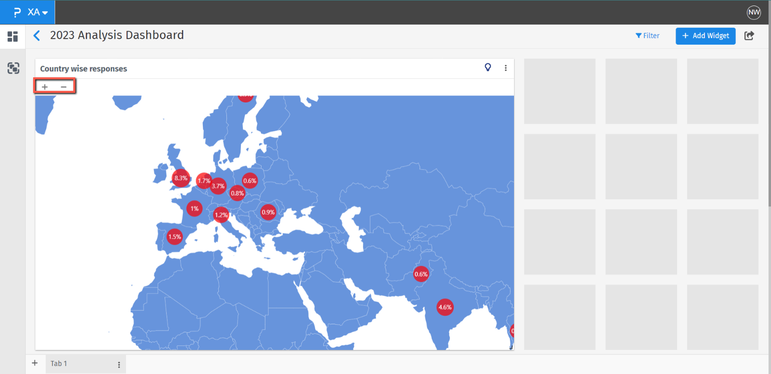
Once you click on any country, in tooltip system will show the name of the country along with other details such as response count or response shares.